Case Study — Enhance AirAsia Flight Booking Experiences
As part of Binar Academy UI/UX Design Bootcamp, We took this problem as a challenge to solve
Introduction
Hello! my name is Muhammad Dzaky Waly Andarwa. I took online UI/UX Design Bootcamp at Binar Academy. We created this case study as part of Challenges during Bootcamp. I work with a team consist of four people, where my role is a UI/UX Designer. I am responsible for creating Wireframe, Layouting, and Surveying on the Play Store review section as part of the research.
This case study was done from 26th January to 12th February 2021 and we divided it into several stages.
Understand
In this stage, we try to understand what users experiencing while using the AirAsia app.
Point of View (POV)

Problem Statement: An employee who has a hobby of traveling needs flight tickets with affordable prices and can be purchased flexibly to support his hobby. Besides that, he is also a busy worker, so he needs tickets that can be purchased anytime and anywhere with wide range payment option.
How Might We? (HMW)
- How might we help users find flight tickets easily?
- How might we help users to get affordable tickets price?
- How might we help users with the payment option?
Define
In this stage, we try to look for what problems the user currently experienced. We identify it by researching on the App Store and Google Play Store review section.

Key Takeaways:
- Complicated payment option
- Users had to manually input passenger detail information
- Confusing back button
based on user pain points, we created a user persona to help us on redesigning the AirAsia app, Meet David Sanjaya!

we also use the Customer Journey Map to better understand user problems on each phase while using the app.

Decide
We created a flow chart for redesigned AirAsia based on the insight that we got from Understand and Define stages in this stage.

Design
In this stage, we created a wireframe to display the basic framework of the design as our foundation for creating Hi-Fi Design and Prototype.
Wireframe

Hi-Fi Design

Prototype
Testing
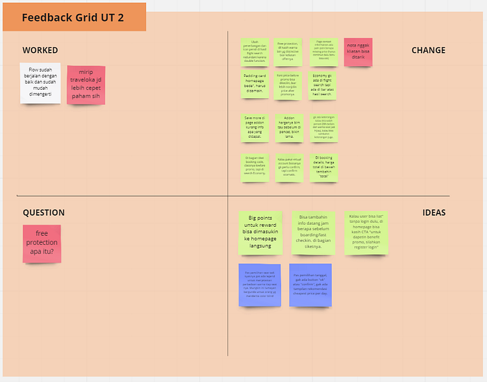
In this stage, we tested our prototype on 5 respondents unmoderated using maze. We use a feedback grid to determine what we need to change to improve our design.
Scenario 1

Scenario 2
Final Metrics
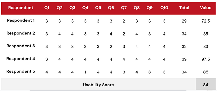
We use System Usability Scale measurement to define our usability score. We took it from five respondent that gave us the final score of 84.
What I learned
- It is hard to see users expressions during unmoderated Usability Testing, it is better to do moderated test live
- Not doing proper sketches lead us to confusion during the hi-fi design process.
- Proper research is a must! we need to better understand our users first before design and development.
Thank you for your time to read this far on my case study. I appreciate your feedback and criticism to make a better design for my next case study or even my project.
Also big thanks to my team
- Arief Satrio as Product Owner
- Dila Aqila as Scrum Master
- Rendy Gunawan as UI/UX Designer
Let’s connect with me on
LinkedIn: andarwaly
Behance: andarwaly
Instagram: andarwalyux